The Role of Colour Psychology in the Workplace
This time of year sees a lot of change, you’ll notice the days are getting longer, the weather is getting warmer each day and your mood is generally a bit more optimistic than normal. As the sun casts it’s golden rays across the UK, it’s as if the weather is giving us a sign that we are finally getting a handle on the global pandemic, meaning we can start to look ahead at the future of the workplace as well as head to the pub garden to meet up with family and friends.
Over the past year, we’ve all been asking ourselves ‘when can we return to our workplace?’ yet we still seem unsure of how to do so. Our workplace culture blog outlines the importance of office culture and how to optimise it to entice your employees back into the office, but one thing we haven’t talked about is how the role of colour in the workplace can also be a contributory factor.
Every design and build project we undertake is bespoke; specific to the needs of the client. Whether we are designing a completely new space, or working on a refurb, as purveyors of the positive workplace we know colours can play a vital role in employee wellbeing and productivity. A recent study found that a well-designed workplace can increase employee’s happiness by as much as 33%! So, with this in mind, we consider the use of colour very carefully with each project we undertake; whether its walls, chairs, desks, meeting rooms or the recharge area, (an important part of any office in our opinion), each area or zone of a workplace can have a clear identity by deployment of colour.
Delving into colour psychology can be fascinating… colours evoke emotions and can have negative and positive effects on your day, as Oscar Wilde said ‘mere colour can speak to the soul in a thousand different ways’. Think about the journey to work, when you see a blue sky in the morning, it makes you feel positive, productive and calm- that’s more to do with the colour blue than it being a ‘nice day’, now think about how you may feel when the sky is grey it can make you feel down and discouraged.
There is conflicting information on what colours to use in the workplace, but we think its more to do with HOW you use colour. Adding accents to furniture or acoustics is a great way of adding some life into an environment or using a graphic on a wall can be a great way to inject personality and energy into a space.
When planning your return to work, use our guide below to see if your office colour scheme will be drawing employees in or turning them away:
Red
- Energising
- Vibrant
- Warmth
- Passion

The key with this colour is to use it as an accent. If it’s used too much you may find it can evoke feelings of anger and feelings of competition rather than teamwork and collaboration, interestingly it can also increase appetite and cause blood pressure to rise.
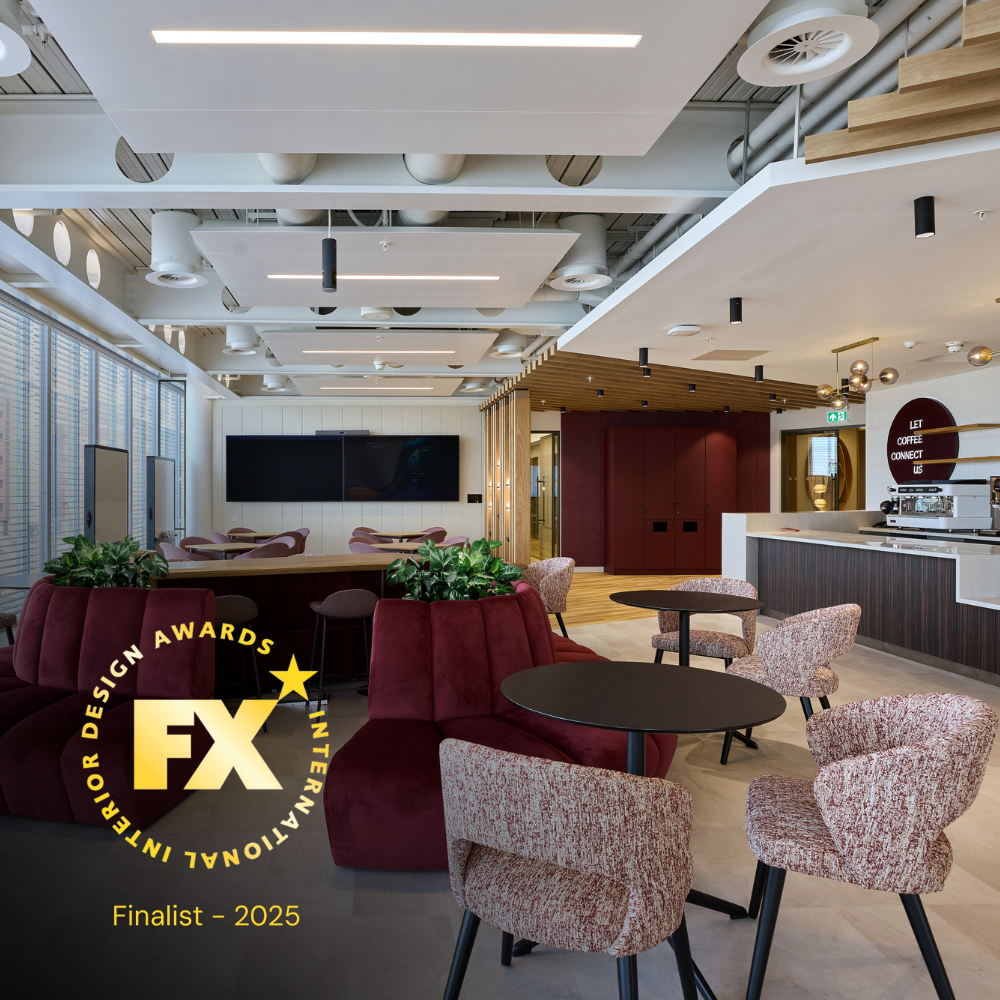
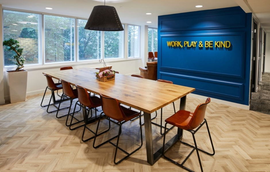
The use of red accents in the is project creates empowerment and warmth in a space that has used lots of cooler, more calming, colours and therefore gives a great contrast for meeting environments, sparking passion and energy.
Blue
- Calmness
- Stability
- Productivity
- Security
- Dependability
Often referred to as the worlds favourite colour, blue is used in a lot of workplaces due to these connotations and is regularly used in company logos and branding as it promotes ‘trustworthy’ feelings. It’s a good colour to use absolutely anywhere in the workplace; flooring, furniture, walls, breakout areas, meeting rooms and in an open plan office.

In this design, blue was used in acoustic panels, open plan area and in informal meeting areas. It was also used on the floor too and on the glass to improve privacy. The primary brand colour was blue, but using various shades throughout creates an allegiance to the company from employees and oozes stability and productivity.
It’s also great to add tonal coloured furniture as these pops of colour can create energy within a holistic overall palette.
Yellow
- Increased creativity
- A sense of fun
- Energy
- Increased appetite – hence why many fast-food restaurants use yellow in their branding

Yellow is a great colour to use in meeting rooms, meeting areas and community spaces. Similar to red it works well when used as an accent on walls, furniture or on acoustics.
Using yellow tensioned rope as a non-structural team divider can create different functional areas that allow more varied workflows.
Green
- Reduces anxiety
- Creates harmony
- Creates soothing energy
Fabulous for creating a calm environment, green is a great colour to be used in areas where people are expected to spend a long time staring at their computers as it can help to reduce eye strain and create balance between the body and emotions.
Also, using green in the workplace doesn’t have to be confined to furniture or walls, introduce green through plants. Having plants in the office adds the colour green and the positive effects listed above, but they also help to oxygenate the air which helps with increasing productivity and lowering stress levels.

You don’t have to keep it to a wall, creating a sense of ‘outside’ inside is also a fabulous idea to stimulate positivity, harmony and productivity.
You could even go one step further with plants and have a living wall installed. This trend has gathered momentum over recent years and looks set to stay around for a while as it brings the outdoors in.
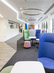
Pink
- Nurture
- Kindness
- A calm environment

Although traditionally thought of as a feminine colour, in a workplace pink is so much more than that. When using the right shade, it can be used in a variety of ways; as desk partitions, furniture and on walls. Using a light pink will create a safe and calm environment which will help promote focus – something employees’ value in open-plan offices. Some people also find bright pink an inspiring, vibrant and creative colour.
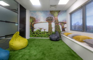
The use of light pink in this breakout area will stimulate feelings of relaxation which will help employees feel calm, rested and ready to get on with their next task.
Colours such as whites, greys and browns tend to get a bad rep for being depressive, bland, boring and uncreative, however, we believe that every colour has its place and when used correctly it is just as stimulating and important as the reds and blues.
White
- Spaciousness
- Brightness
- Cleanliness
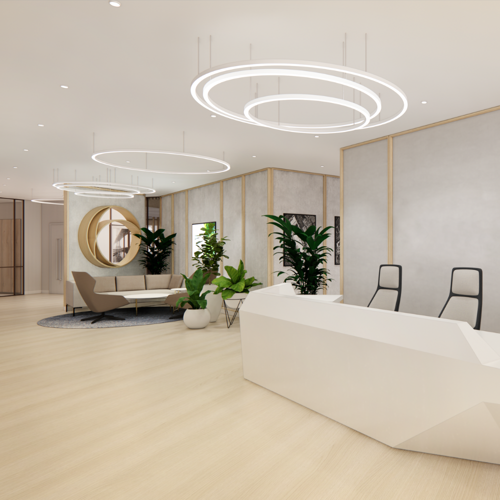
White is great for opening up spaces and allowing other colours to shine just as in your home. It works well as a background for colour accents like yellow, red or blue which will promote productivity and positivity. It can be used on walls, furniture and in all areas of the workplace. The key is to balance it well with other colours to avoid a clinical, harsh environment which can occur if used too much.
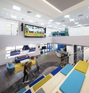
By keeping the walls white in this atrium staircase it allows the vibrant colours to do all the talking. This is an area of energy, productivity and trust, plus it has an open feel with lots of natural light flooding in.
Grey
 Interestingly grey is a neutral colour and doesn’t immediately have a psychological effect, however, depending on the shade and what other colours surround it, it can be deemed a negative colour.
Having a combination of white and grey act as a great background for the brand colours that have been used in the furniture for this project. This will work to reinforce brand identity, values and ethos for the company.
It is clear to see how colour can affect workplace productivity and impacts on whether employees have a positive workplace. Whilst its always important to incorporate the brand into a workplace design, it is also important to remember that people react differently to colours. When choosing the colour scheme, whether contemplating a refurb or moving to a new location, consider the following:
- Use colours to zone the workplace, this encourages employees to use the areas in the way they are intended
- Use greens and pinks to create calmness and reduce anxiety, and try reds, orange and yellow in areas designated for collaborative working
- Open plan working is now the norm, however, breakout areas decorated in blue will promote productivity and allow employees to focus on the task at hand more efficiently
With lots of employees still likely to feel nervous about mixing with co-workers, even if they have received both doses of the vaccine, try incorporating more calming colours such as light pink or blue. To encourage collaboration and ignite the vibrant culture you may have lost over the past year, try using reds and yellows; they can also inspire infectious creativity that can spread throughout the company.
All in all, don’t be afraid of introducing colour into your workspace or your brand, it will have positive rewards to your business and your employee’s wellbeing. If you are thinking about an office refurb or you need to move to a new premises’, please don’t hesitate to get in touch with us, and we will be more than happy to discuss your needs.